Operator-Centered Design
Design for the person wearing the gloves.
What building an MES for a welder's headset taught us about interface design.
By Javier Ortiz
Everyone says manufacturing software should be "easy to use." Almost nobody means it. We recently redesigned the ForgeOS operator screens for a welder wearing a headset in a loud plant, and it reset how we think about interface design.
The lesson underneath all of it is simple to say and hard to live by. Operators don't browse. They execute the next thing. The screen in front of them is not a place to explore your feature set. It is a place to answer one question: what do I do now?
You cannot train away a bad interface
The usual response to an interface operators reject is training. It does not work. You can train someone to use a bad interface. You cannot train away their knowing it is bad. So within a few weeks they build a shadow system next to the platform you paid for. Spreadsheets. Clipboards. Informal logs that quietly replicate the exact thing the MES was supposed to replace. The system keeps running. Nobody trusts it.
The principle: density should scale with trouble
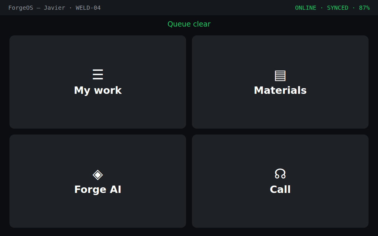
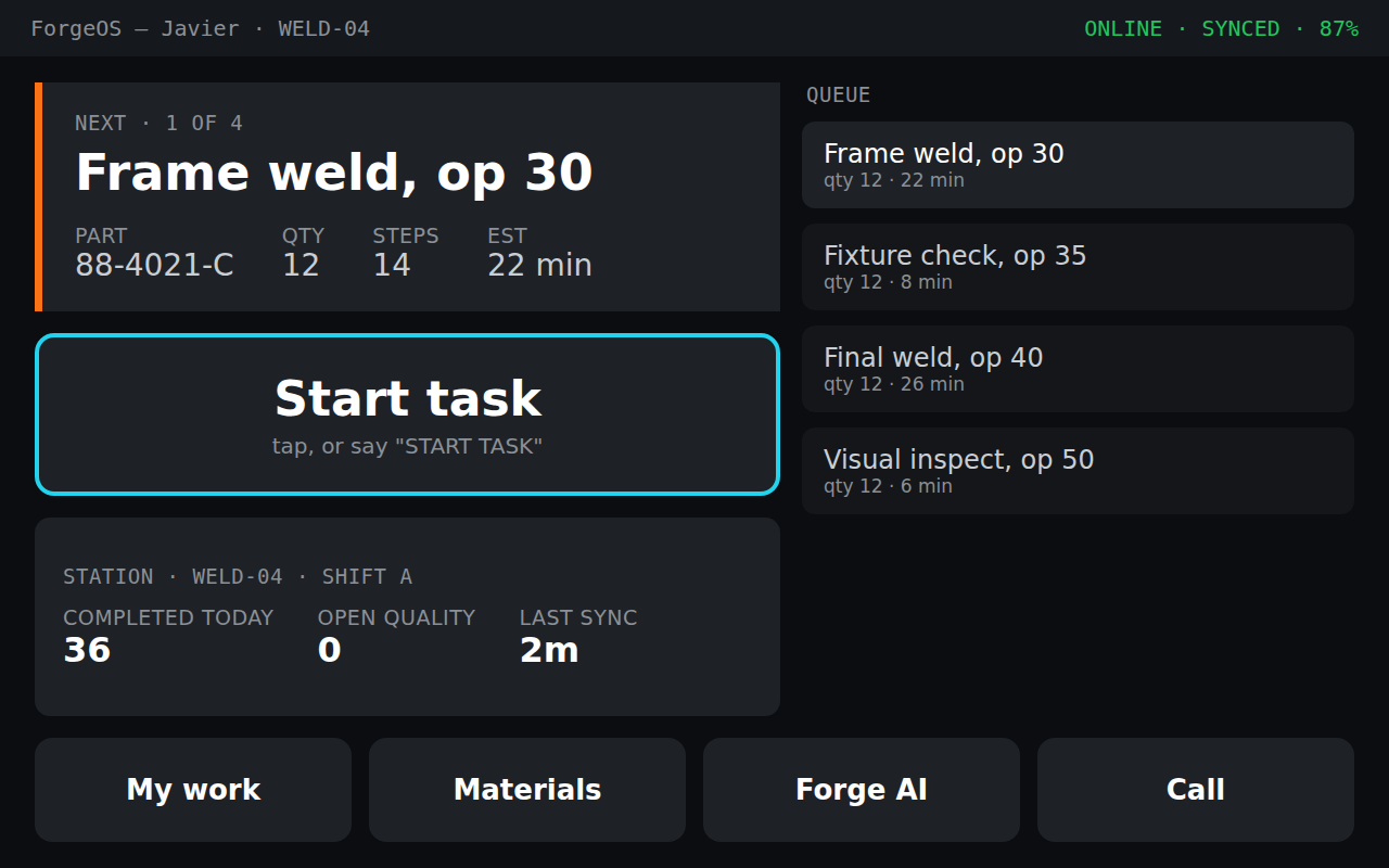
Here is the rule we designed to. Information density should be inversely proportional to how well things are going. When everything is fine, the screen should show almost nothing. When something is wrong, it should show exactly what is needed to act, and nothing else. Most MES screens do the opposite. They show every option all the time, and leave the operator to find the one that matters.
The clearest way to explain it is to walk the same station through three moments.
When things are fine
When there is work
When something is wrong
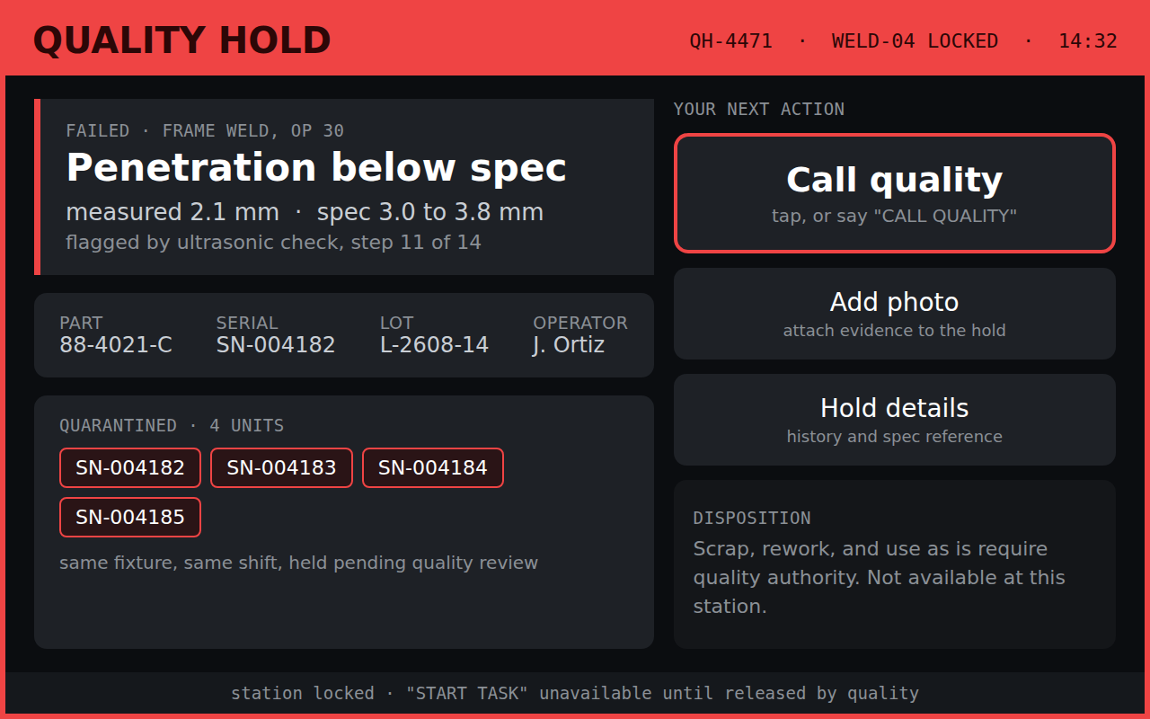
This is where density earns its keep. "Penetration below spec" is a notification. "Measured 2.1 mm, spec 3.0 to 3.8 mm" is a record. The operator sees what failed, what else got swept into quarantine and why, and the single thing they are allowed to do about it: call quality. The controls they are not allowed to use, scrap, rework, use as is, are named on screen as quality authority, not hidden. An operator who cannot see why a control is missing assumes the system is broken and works around it.
Make the technology disappear
On a headset, in a loud plant, with hearing protection on, anything off-screen is unspeakable, and a voice command that fails twice gets the headset taken off for good. That constraint forces honesty. Every visible label is the spoken command, so the screen teaches its own vocabulary. The word "SAY" appears exactly once. And color carries meaning only when it is scarce: red appears in one place, the quality hold, and nowhere else. The moment red also means overdue, and low battery, and warning, it stops meaning stop.
The hard part is what you leave out
A dashboard that shows everything is easy to build. It requires no judgment. Simplicity at the front takes sophistication behind it, the models and rules deciding what is worth surfacing and what to hold back. That work is invisible by design. If the operator has to think about the system, the system has failed.
Which is the whole point of operator-centered design. You build it for the person wearing the gloves, not the person signing the PO. Keep the interface quiet, and it disappears into the work. That is the highest compliment a tool on a factory floor can earn.